Improving your plots using Inkscape ♠

Hello everybody! 👋
I use Excel a lot 📊, and even though its graphics are decent, in some occasions I couldn't customize them to my liking. I had the same issue with some R libraries and some other specific bioinformatics software (most of the time, their graphic outputs are awful). Until one day a co-worker introduced me to Inkscape ♠. It's an open source CorelDraw-like software, that lets you manipulate vectorial graphics (in Windows and Linux). I had no prior experience with graphic desing (and I still don't have it 😂), but I'm happy with the final results I'm getting.
 I'm going to show you a small example of what you can do with Inkscape.
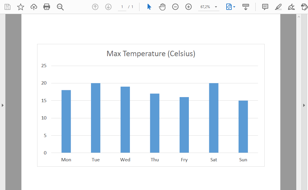
1. Make your Excel plot
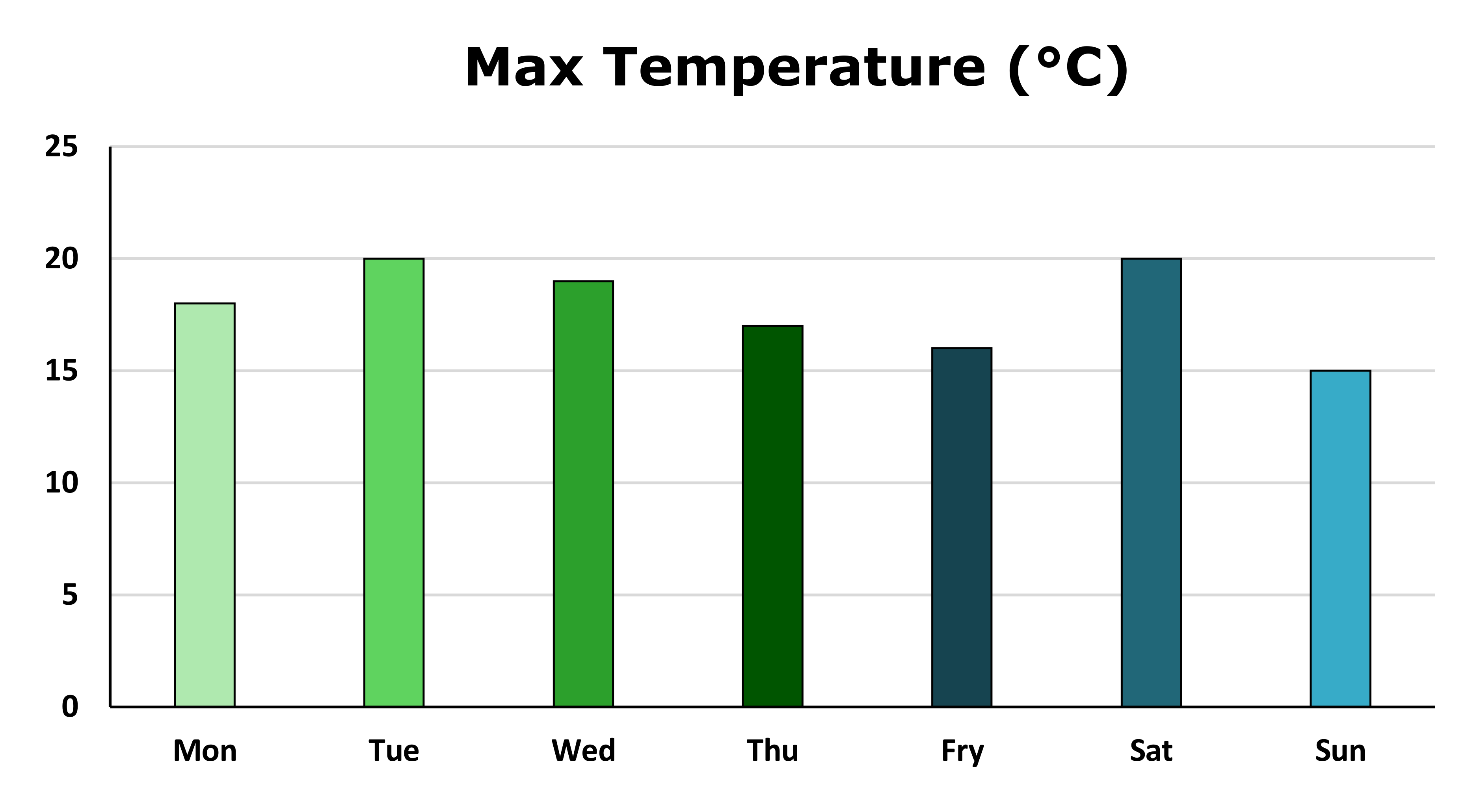
I've made a simple bar plot with the maximum temperature of each day in a week (using fictional data).

2. Export your plot as pdf
This is a really important step. In order to edit your plot in Inkscape, it has to be a pdf (or other vectorial file). So you just have to select your plot in Excel, then go to file - export - create pdf document.
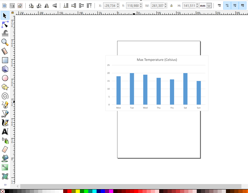
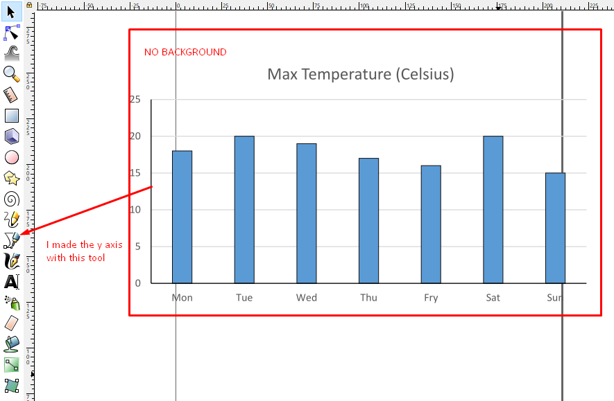
3. Import your plot in Inkscape
Next, press ctrl + i (or go to file - import...) in Inkscape to import the pdf file you just created. You will be shown some options, but you can click "Accept" and use the default ones. You will see something like this:
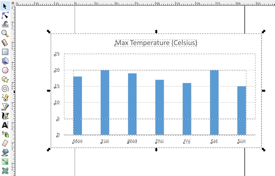
4. Ungroup everything!
By default, your plot is grouped. You need to select it and press ctrl + u or ctrl + shift + g until every component of the plot can be moved or edited individually (just like in the image below). Note that bars will still be one element.
5. (Optional) Ungroup the bars
If you want to modify the bars individually (maybe change their colors), you need to uncombine the paths (I won't get technical because I don't have strong foundations in this area, but follow me, it works! 💪). You can do this by selecting the bars and then pressing ctrl + shift + k, or go to Path - Uncombine.
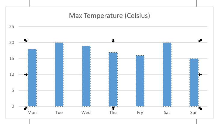 In the picture above, each column is selected individually.
6. Customize
Now you can basically do what you want to the plot. It's pretty simple to make basic improvements (and you can also make super pro stuff, but we're not graphic designers...at least, I'm not one 😂). For example, I like to remove the background from the figure and add a black border to the axes and the bars:
I also like to modify the label's font size and the default color of the bars:
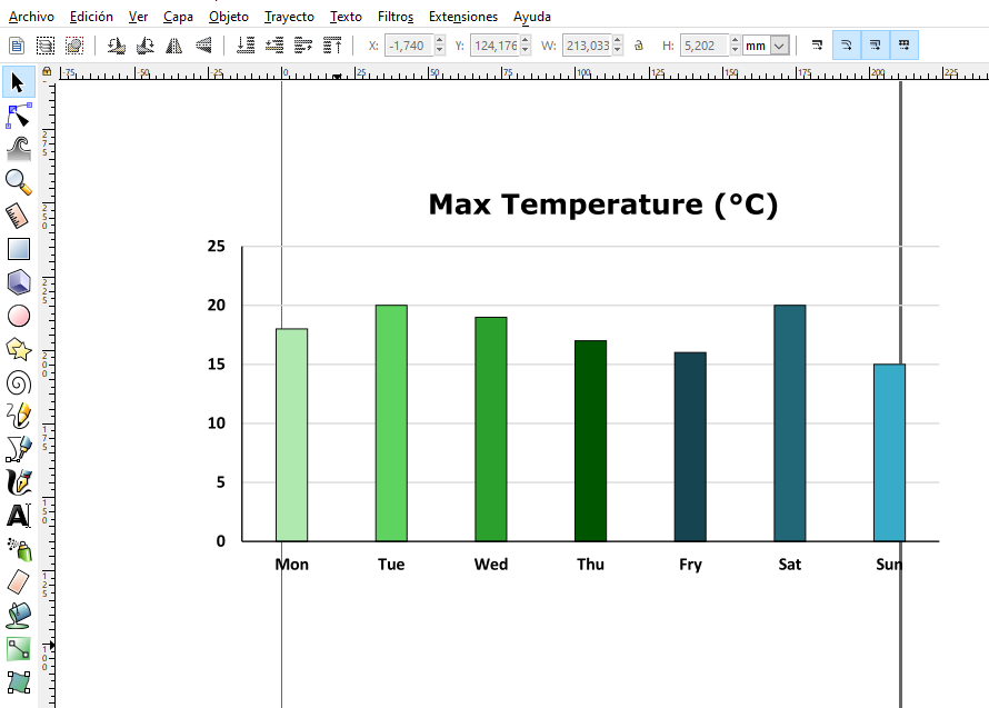
These things can be easily done by clicking in the color boxes that you see in the lower part of the screen (or you can go to object - fill and border... or press ctrl + shift + f to display the menu).
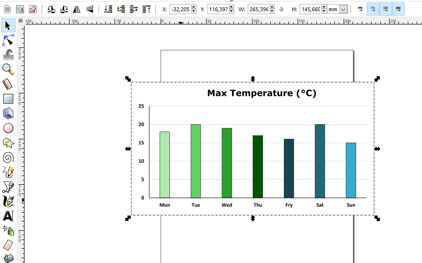
7. Final steps
Before exporting your plot, you need to add a solid background to it:
And finally, you can save it to a .png file:
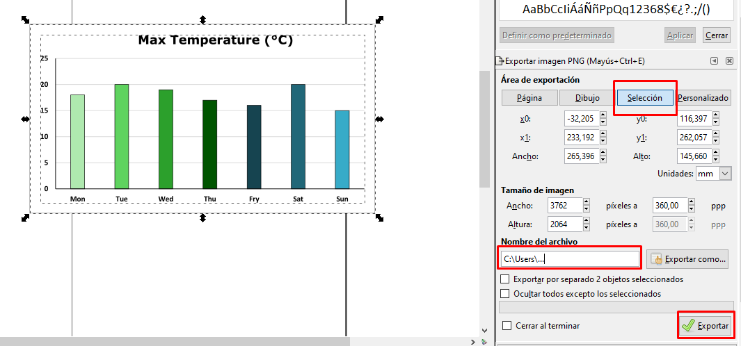 Make sure your plot is completely selected, that the button Selection is checked (mine is in Spanish, I highlighted it), add an output path and finally click Export. You can see the result below:
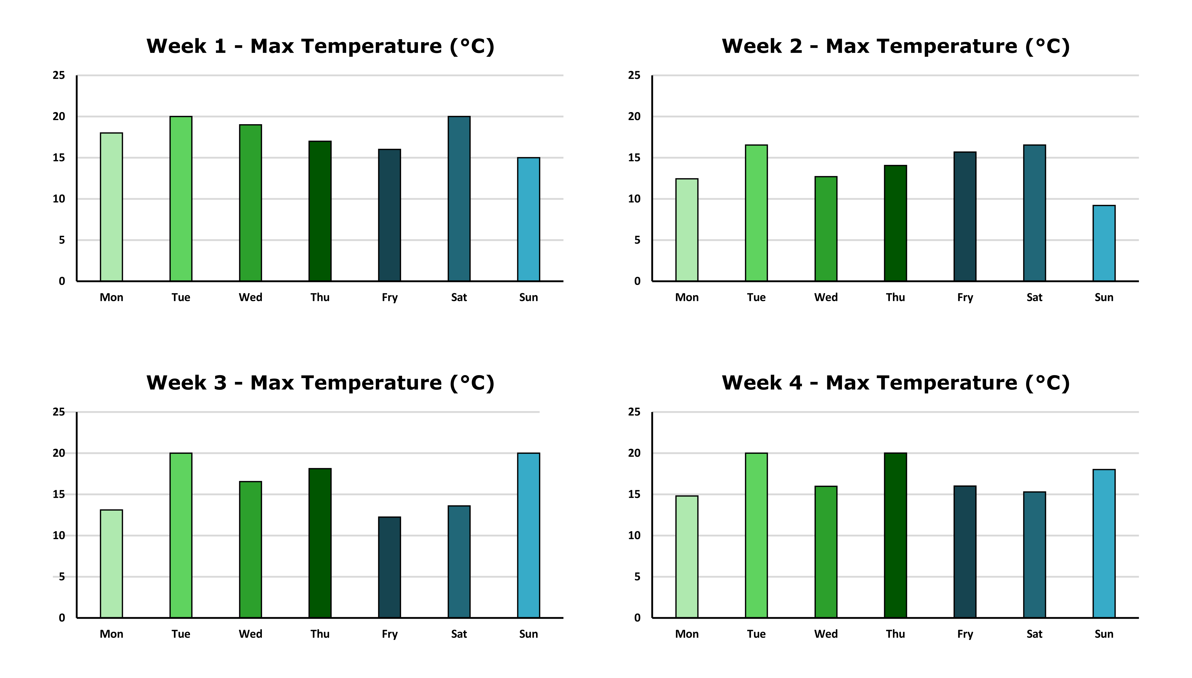
Since I discovered Inkscape I've used it for every presentation I had: slides, posters, papers... everything. It let you do really good graphics, and it also work for R and Python plots (as long as you export them as .svg or .pdf). You can also group several plots together:
And that's all. I hope you find this article useful. If there's enough interest, I can make a detailed tutorial in the future. I think it's a great (and free 🤑) tool that helps you show your data to your colleagues or another audience.
Until next time! 🙋♂️
(I also used Inkscape to create the cover image of this post).


